DIEP Website Revamp and Optimization
During my time at the Diversity, Inclusion and Equity Programs (DIEP) at Californa State University, Fullerton, I spearhead a final web design project to restructure and organize the office website.
Research
Before starting on any wireframing or visually concepting, I looked up adjacent university's diversity & inclusion websites—how they were organized, how templates were utilized, and structures of information. The University of Central Florida's DIEP page was a strong favorite of mine.
I audited and mapped out the current DIEP website. I noted link overlaps, deeply buried pages, missing content, ease of readability, and more. Afterwards, I sent the site around to some peers for user-interaction tests and interviews over Zoom.
Finally, I interviewed the DIEP Managers and asked how a website impacts each of their roles, their own purpose for a website, and needs, wants, & wishes for the new site.
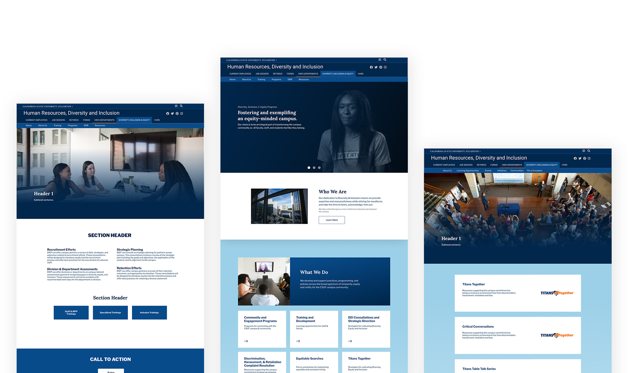
Wireframes & Strategies
Wireframing this project relvolved around CSUF's CMS system, OU Campus. OU Campus utilizes a template-based block system layout for webpages and required a working knowledge of html/css standards. Working in conjunction with the CSUF webmaster through each step of the wireframing process was a valuable method of minimizing miscommunication and ensuring functionality across each page.
From the start, I knew I needed to design for repeatability after handoff, so my strategy was to deliver a range of templitized pages for common usage on top of a reimagined landing page.
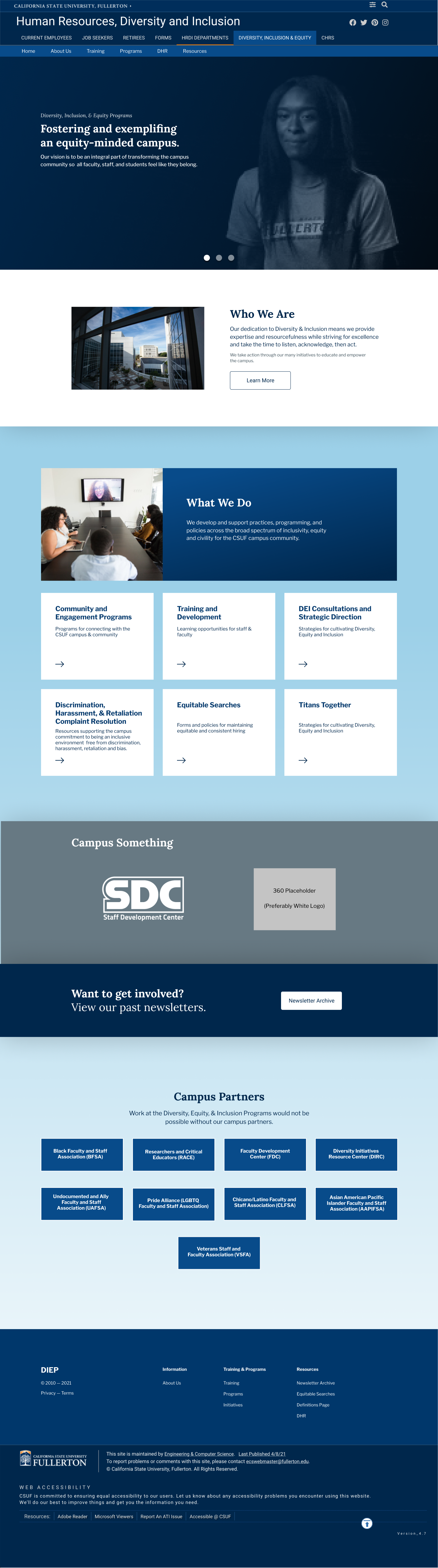
Landing Page
The landing page was the foundation of the website structure, mood, colors, and design systems. Colors, buttons, and card structures were inherited from the California State University, Fullerton brand—which I orginized in Figma libraries.
The desired webflow for the landing page was to introduce, explain, inform, and engage. The head of the DIEP office had informed me that historically, users accessing the DIEP webpage were majority first-time vistors and had no idea the office existed.
The "who we are" and "what we do" sections were crucial in leading the user down the page and providing relevant information as quickly as possible. These two sections direct to the most shared links across direct emails and face-to-face conversations by office manager.
The campus initiatives section boasts the work DIEP has done on-campus in the past few years and leads into a newsletter sign-up CTA that also links back to previous newsletters. This section serves to provide further information about the Diversit, Inclusion and Equity Programs' current work and grow email prospects and contacts.
Lastly, the campus partners block serves as a catch-all approach to limit user drop-off. The purpose of this section was to provide links to the DIEP office's sister departments across the campus—in case a user was searching for a related office or initiative.
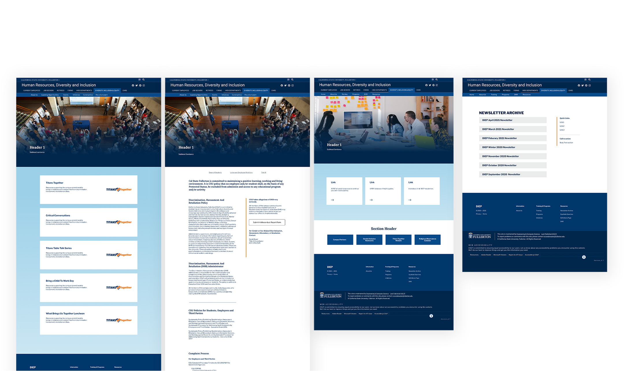
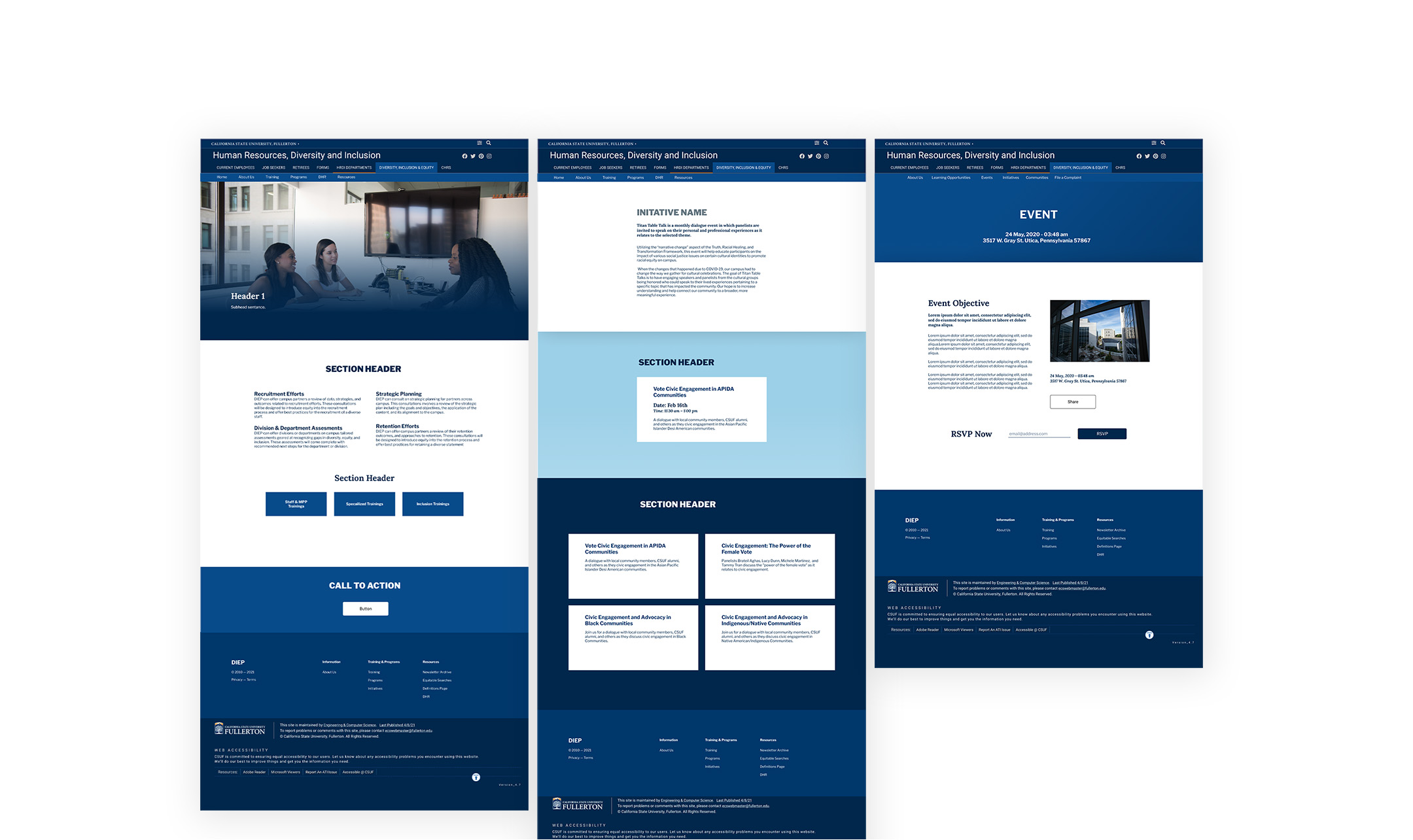
Secondary Pages
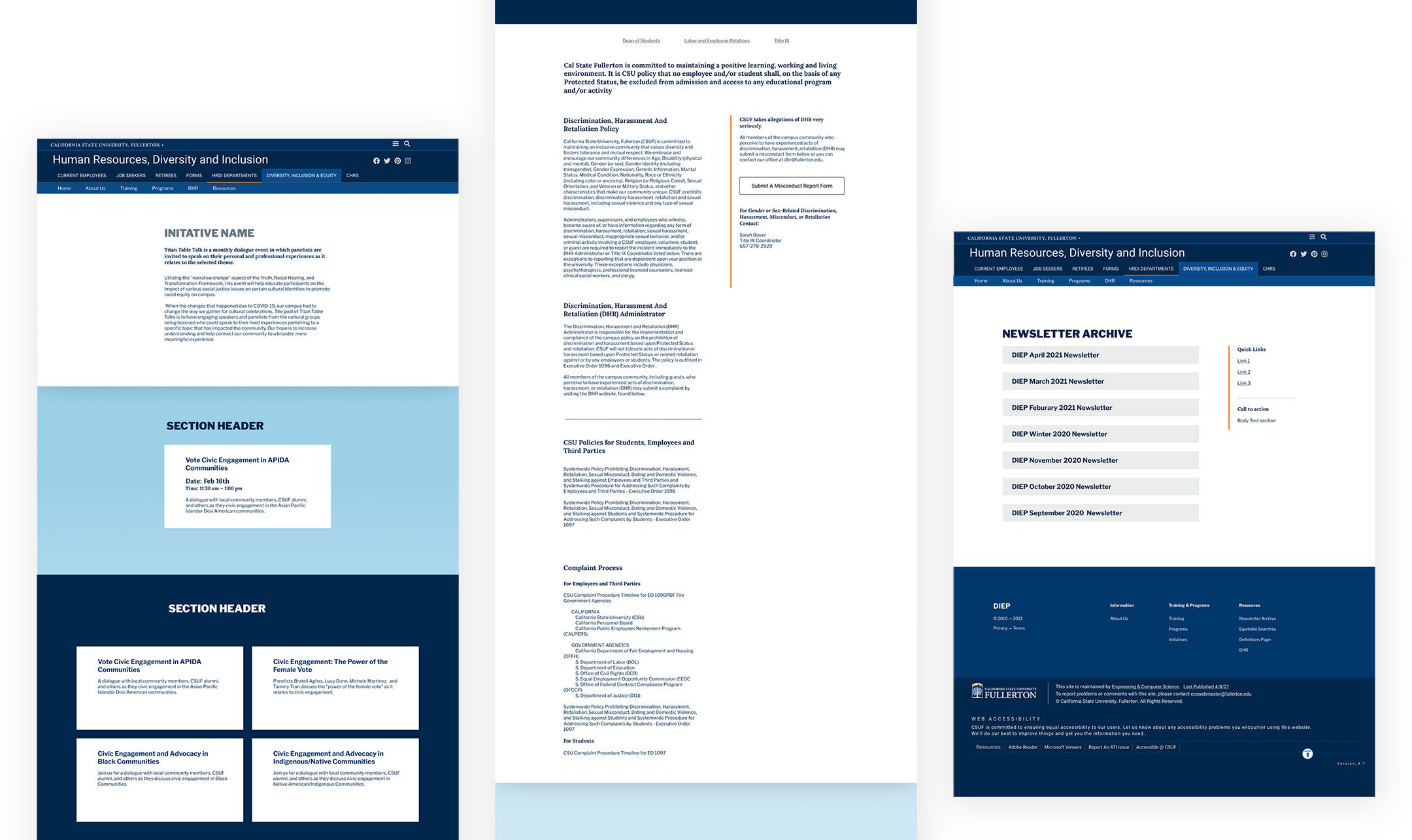
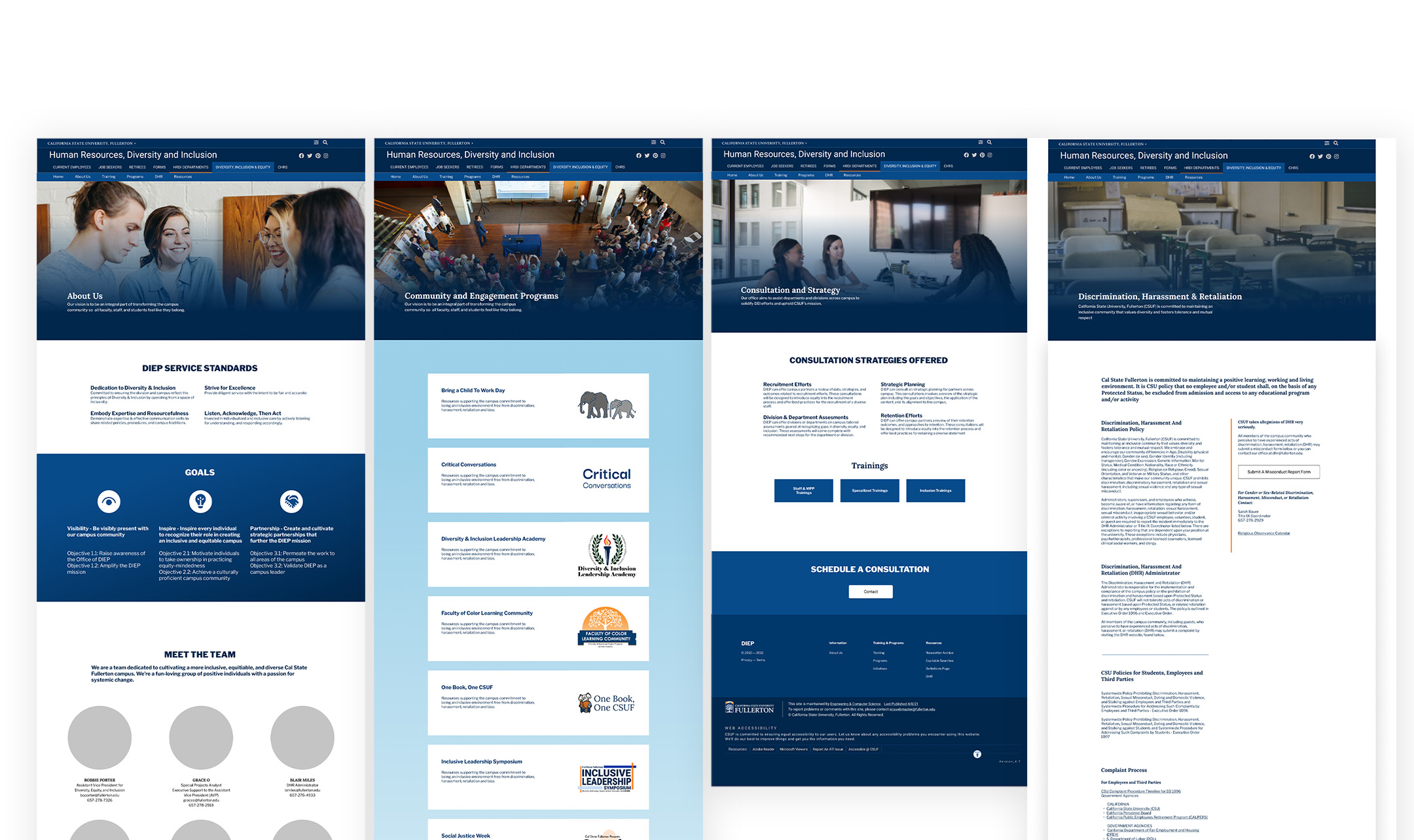
I identified the necessary secondary pages through my Manager interviews and based their structures on each page's content. It was important that each page remained consistient in look and feel of the DIEP splash page. About page; Community and Engagement Programs page; Consultation and Strategy page; Discrimination, Harassent & Retaliation page; Equitable Searches page; Resources page; Staff Development Center; and Training & Development page.
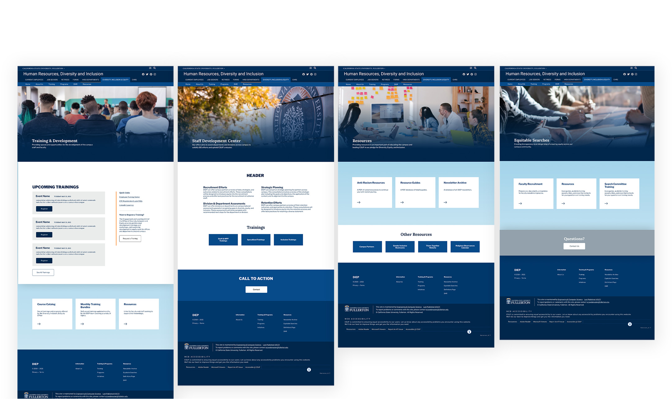
Templatized Page Structures
Because of the office's continued growth and development, it was crucial that I create a set of template pages for future events, programs, initiatives, programs, and more. These templates were based off of the secondary pages' designs and likeness but serve as building blocks in Figma for future designers to create and expand on.
My time at the DIEP office was also limited so these templates needed to be simple structures to hand-off to any oncoming designers or developers.
Final Deliverables & Outcomes
Upon completion of this project I had crafted a revamped landing page, 8 secondary pages from existing site content, and a library of 7 common-use page templates for future scalability.
Handoff of digital assets and template structure occured before the expiration of my time as a student assistant and to my knowledge, implimentation of the webpages is ongoing.